Alright guys,
Welcome to the premiere episode of WCAG Wednesdays where each week we walk through the success criteria for the Web Content Accessibility Guidelines.
In today’s episode I thought we’d start at the beginning. Before we dive into the success criteria, I thought it might be good to take a look at two key items. 1. Short history of the WCAG Guidelines and 2. The 4 basic principles that drive them. Known as the POUR Principles.
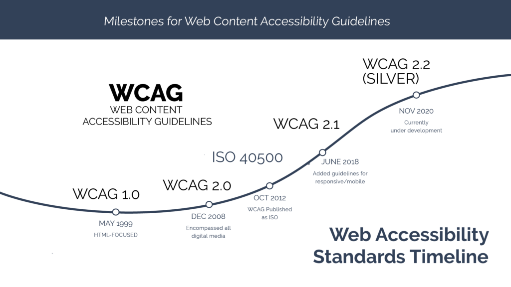
WCAG stands for Web Content Accessibility Guidelines. But before the 1.0 release in 1999 Gregg Vanderheiden compiled his own guideline in 1995 sparked by seeing a keynote speech by Mike Passiello. Between 1995 and 1999 more than 38 different web guidelines were released from various sources. Eventually, these were compiled into the Unified Web Site Accessibility Guidelines and was the starting point for what became WCAG 1.0. While WCAG 1.0 focused mainly on HTML. In 2008 WCAG 2.0 was developed to encompass all digital media. In 2012, WCAG 2.0 was accepted by the International Organization for Standardization as an ISO International Standard. WCAG 2.0 was updated in 2018 by the WCAG 2.1 released to add guidelines focusing mobile accessibility. And as you may or maynot know, WCAG Silver is the continuing evolution of WCAG and is due to be released sometime in the near future.
So that is an overview of WCAG. Thanks for sticking with me so far. I always say that before you know where you are going, you have to know where you have been.
I also think it is important that we understand the 4 basic principles behind the WCAG Guidelines and Accessibility in general. These guidelines are often referred to as the POUR Principals. Perceivable – Operable, Understandable and Robust.Because even if you can’t remember Success Criteria 1.3.1 (should be 1.4.1) Use of Color Only, I bet you can remember the word Perceivable.
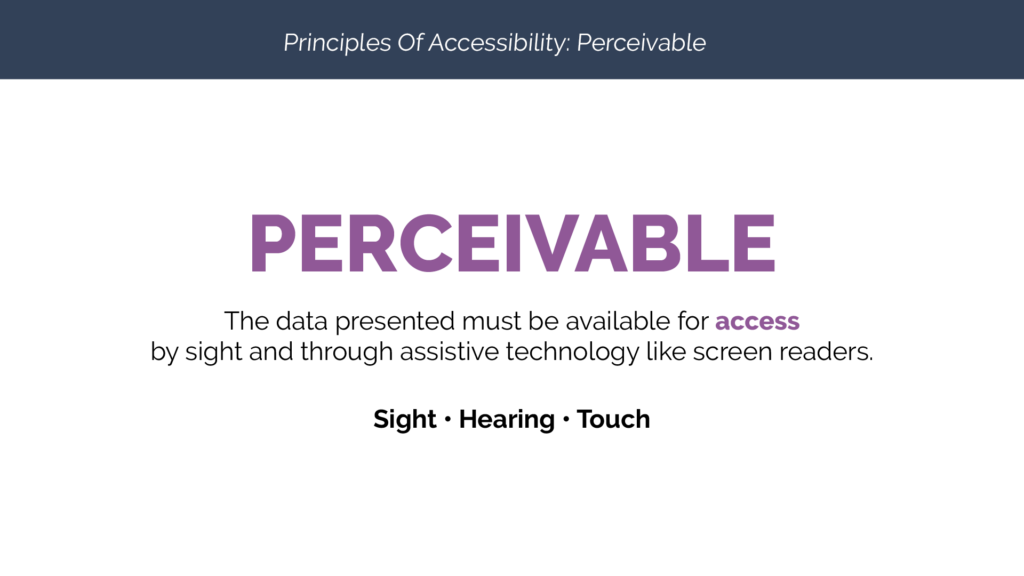
Perceivable – The data presented must be available for access by sight AND through assistive technology like screen readers.
Access is the key word here. Because if there is no way for a screen reader to get to the content to identify or voice the content, then, to those using assistive technology, that content really doesn’t exist.
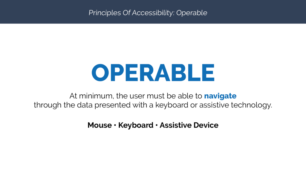
Operable – At minimum, the user must be able to navigate through the data presented with a keyboard or assistive technology.
This goes hand-in-hand with Perceivable. Maybe you have done your job by adding the proper markup. But, if someone can’t use the keyboard to navigate to the content or in the case of things like pop up windows, back to the original content, the presentation is definitely not operable.
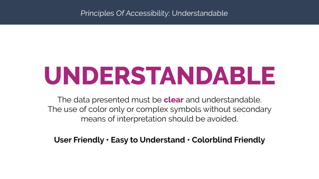
Understandable – The data presented must be clear and understandable. The use of color only or complex symbols without secondary means of interpretation should be avoided.
This is the one that seems to trip up people the most. On one extreme you have people who think adding alt-text to an image of a table is just fine. And on the other hand you have those who want to make sure that every element has a 3 to 1 color contrast ratio or a patterned fill and end up with a map, chart or graph that is so visually complex that it violates the very principal the designer was trying to comply with.
In this series we are going to spend quite a bit of time focusing on different elements of this POUR principal specifically. We will explore several ways to present clear and understandable data. So hopefully you hit that like button and subscribe to my youtube channel so we can take this journey together and meet back here each wednesday.
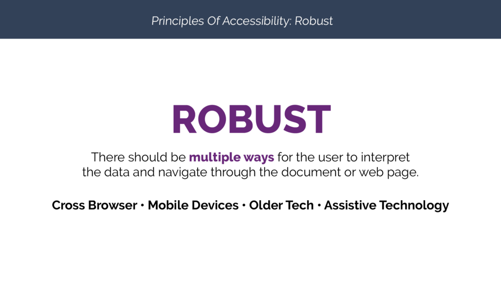
The last of the four principles is Robust. Which states “there should be multiple ways for the user to interpret the data and navigate through the document or web page.
This principle really speaks to structure. Because when we use things like headings, captions, and lists, we give users landmarks and launch point options for digesting our content. While most of us read a novel from beginning to end, all of us read magazines differently. Some scan the table of content and look for headings that seem interesting. Some flip pages looking for photos or graphics. And others know exactly what they are looking for and head right for those awesome surveys to find out what your love language is, right?
The point is, that we all digest information differently. So giving people who use assistive technology those same options is important.
Well that brings us to the end of our first episode of WCAG Wednesdays. If you can remember these four principles, as you design documents, websites, apps or interfaces, you will spend a lot less time fixing things to make them accessible and a lot more time designing things that are already closer to accessibility standards.
I know this was just an overview, but Accessibility is such an overwhelming topic for a lot of people that I thought I would start with the basics. For those of you who can’t wait to dive into the key specifics of accessibility, stick with me. It is coming. I promise we will spend plenty of time discussing all things accessibility in the weeks to come. But that only happens if you hit that like button and subscribe to my series so you get notified when my next video is released.
Until then, this is Dax Castro wishing you, happy tagging.


Comments