


Starting down the road of accessibility can be daunting. Understanding the tags tree, alt-text, read order, table headings and content panels can be overwhelming at first. If your role is remediation specialist there as a level of expectation that requires training and compliance. But what if your not an expert? There are several things you can do to create documents that have elements of accessibility as you develop your skills and knowledge.
This post will cover the top 5 things you can do to create a basic level of compliance. Some might argue that a document is either compliant or not. But I propose that having some tags and basic readability is far better than simply “printing to PDF” which results in a tagless document that is basically blank to someone using assistive technology.

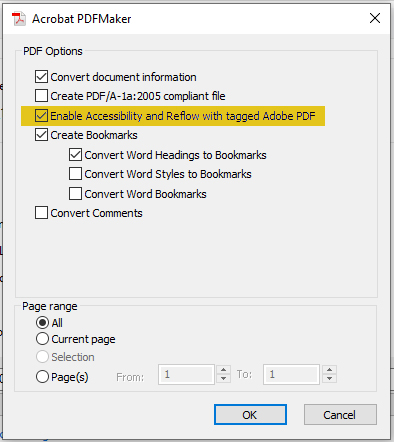
The first and most impactful thing you can do is save to PDF rather than choosing Print to PDF. Saving to PDF with the “Enable Accessibility and Reflow with tagged Adobe PDF” option starts the process of tagging your document and if you have used the standard formatting tools your document will have many accessible features without having to do much of anything else.
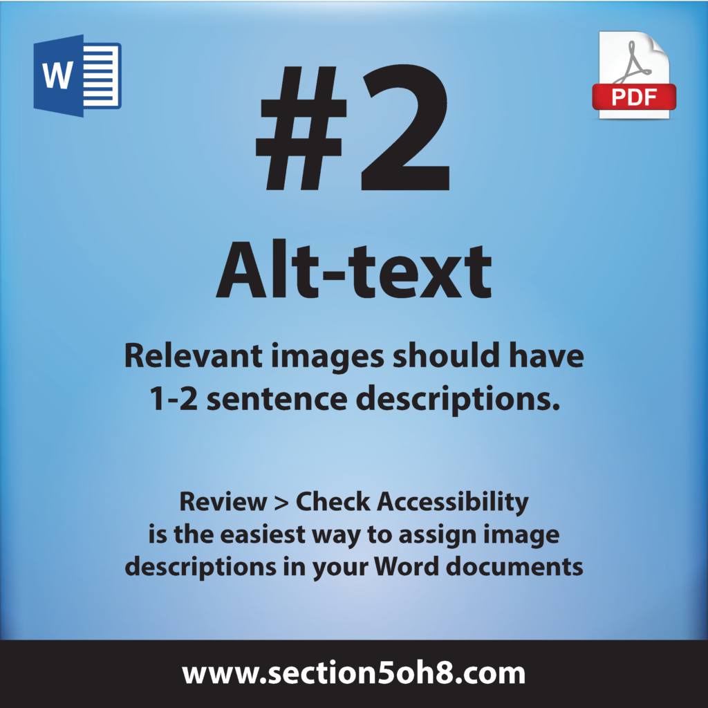
There are two types of images in a document. Ones that contain meaning and support the text in a document, and ones that are purely decorative and convey no meaning or context. When creating alternative text (alt-text) you should keep your descriptions brief and relevant. Describe the image in a couple of sentences. Alt-text can be a very subjective topic, but remember that your images should support the text on the page. If you find yourself writing overly complex and lengthy alt-text descriptions, it is a sign that you may be relying to heavily on the reader’s ability to draw complex conclusions from your images. Your text should do all the “heavy lifting” and your images should help tell the story.
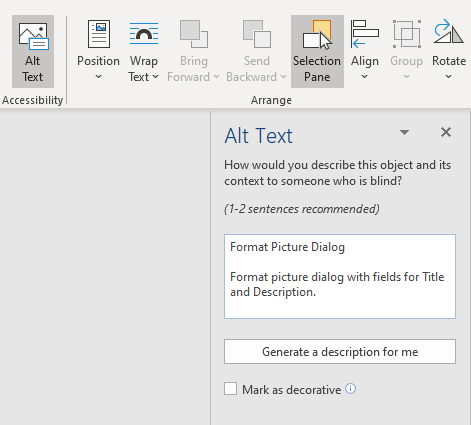
To assign alt-text you can do it in one of two ways. The first way is image by image. Select your image and then open the Selection Pane. Depending on the version of MS Word you are running you can access the Alt Text box by directly clicking the Alt Text button or by clicking on the Format Image dialog box. Then simply enter a couple of sentences that describe the image.
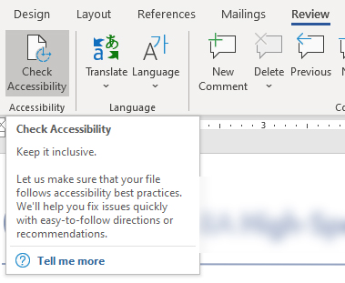
The other way to set your alt text is by running the “Check Accessibility” feature in the Review tab. This can be an easier method since it will check for Alt Text for the entire document automatically.

Using headings in your document helps break up information into digestible blocks of content that help the user navigate and understand your content much easier. It is important that you use the headings buttons at the top of the tool bar and avoid simply increasing the font size and weight of a title by using the “Bold” and “Font Size” options. Manually increasing font and weight may make your text might look like a heading, but without using the standard headings styles in Word your PDF will not be tagged correctly. Remember, you can change the look of the Heading 1, Heading 2, etc. to match your document style, but it is important that the headings are set using the heading feature.

Sidebars and images are the most common reasons a person might use a floating text box. Without using the inline with text feature, a PDF will not know where to put the image or content. Many times it will just be added at the end of a document or section. To ensure that your sidebar or image appears in the read order you want, using “In Line with Text” is mandatory.
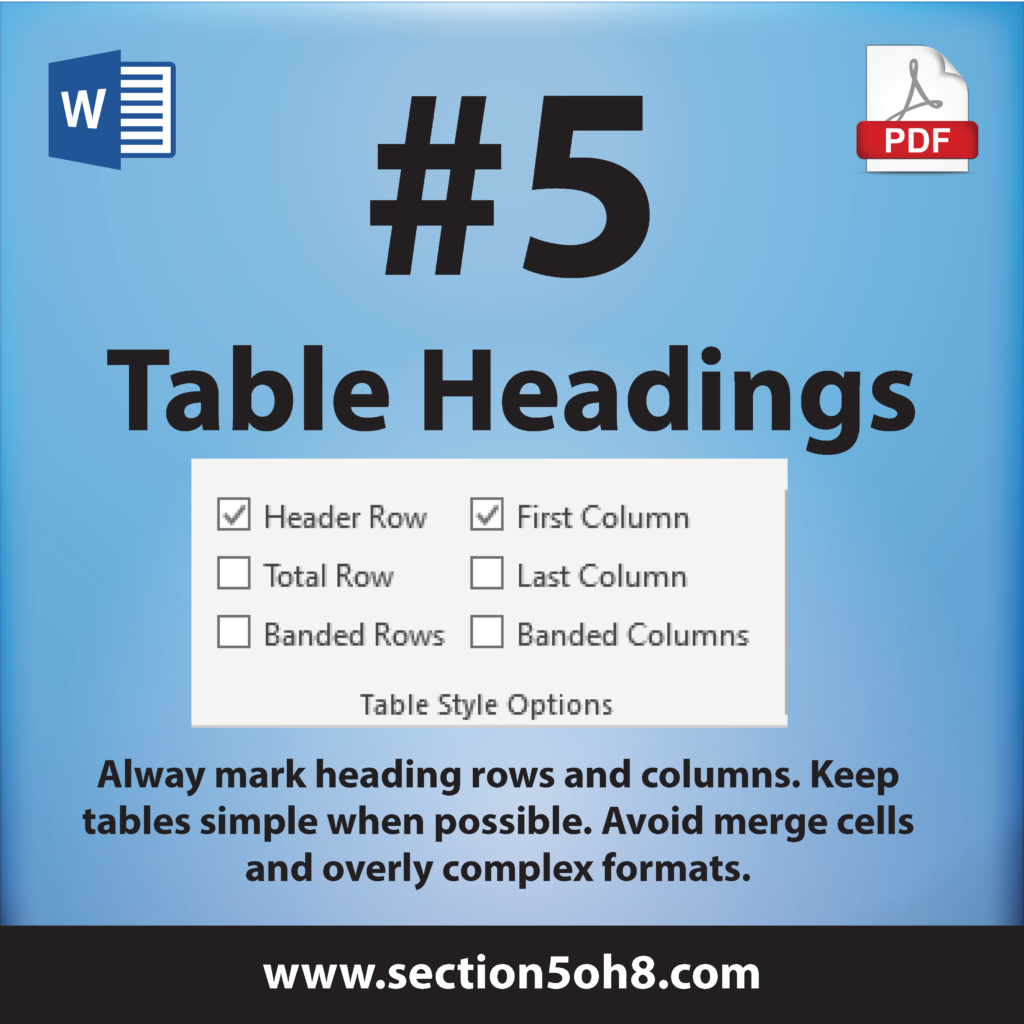
Tables seem to be the hardest things within a Word document to maintain accessible formatting. We often find overly complex tables that really should be a series of separate tables. In other cases, we see tables used to simply layout text. These are considered layout tables and not data tables and should be avoided. Tables are best suited for data only. When formatting large blocks of text, it is better to use text columns and margins instead of dumping your content into tables.
As a blind person, or someone using a screen-reader, navigates a document the tables headings help the reader understand where they are within the table. It is important that you mark heading rows and heading columns where appropriate. This allows the reader to maintain a reference within the table when moving from cell to cell.
Conclusion
Although the 5 steps above will give your document a good basic start, these are by no means a comprehensive list. Screen-reader accessibility includes a series of formatting and settings that ensure all items within the document are accessible and understandable by the reader. The tips above are meant to give you some basic steps to follow as you start your journey into accessibility. My hope is that this post will spark something within you to learn more about accessibility and what steps you can take to ensure that the documents you produce are accessible to all people no matter what their ability or method of reading is.
Dax Castro
Remediation Specialist | Accessibility Advocate
Member IAAP | International Association of Accessibility Professionals
Thanks for sharing your expertise!